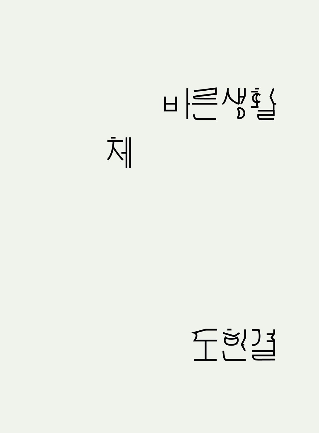


바른생활 체
typeface tabloid, 90x530mm, 2013
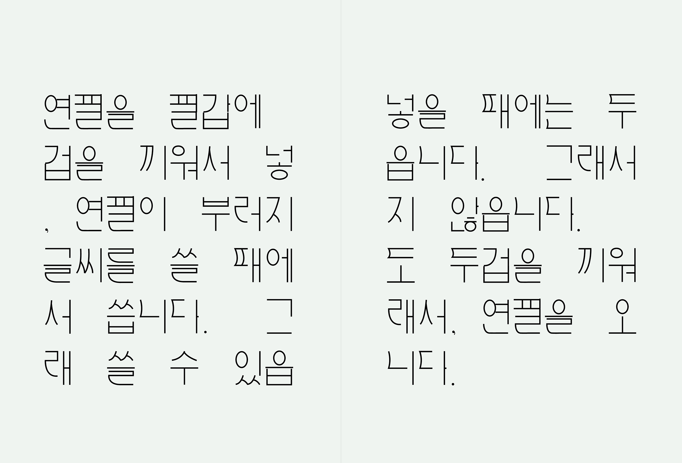
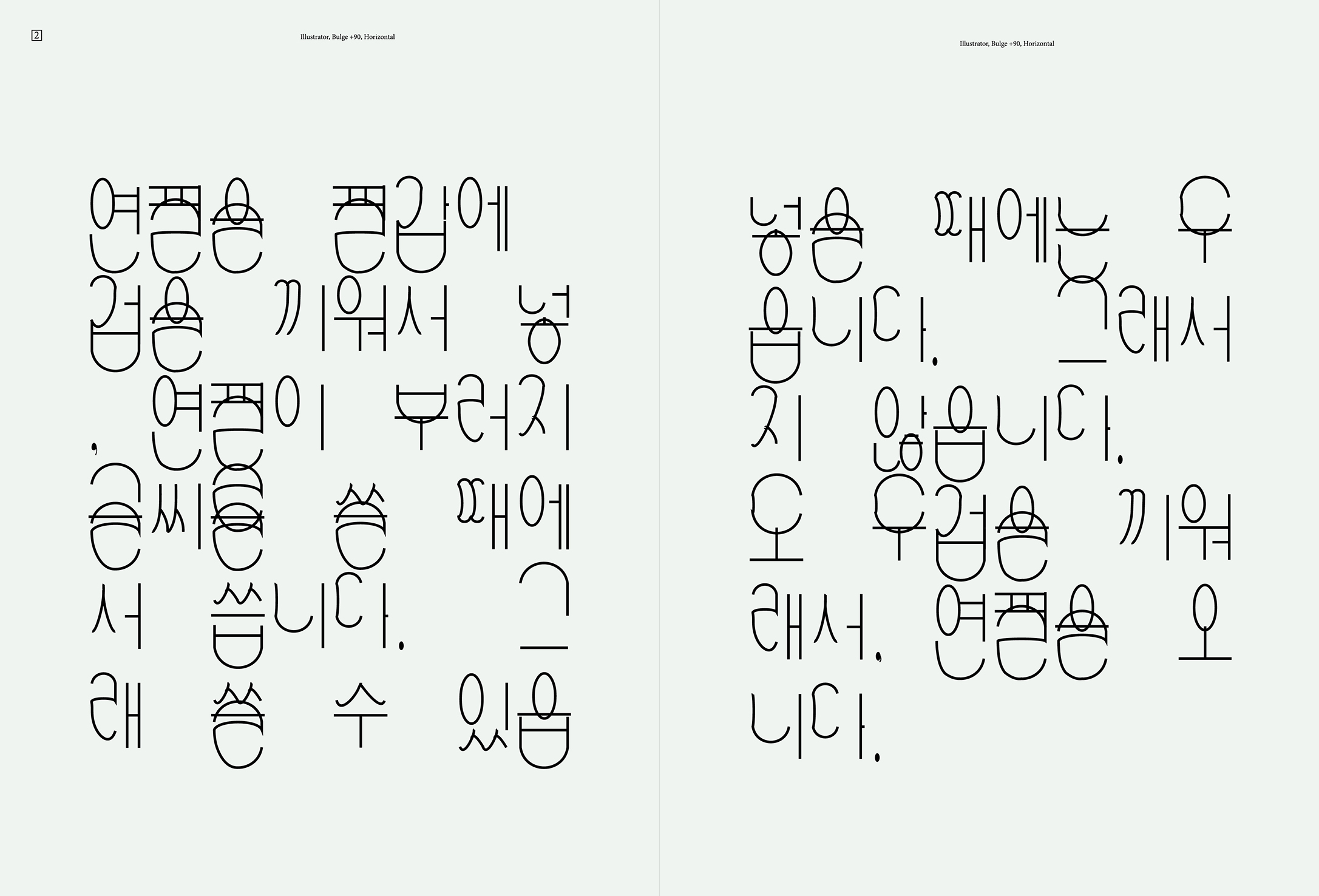
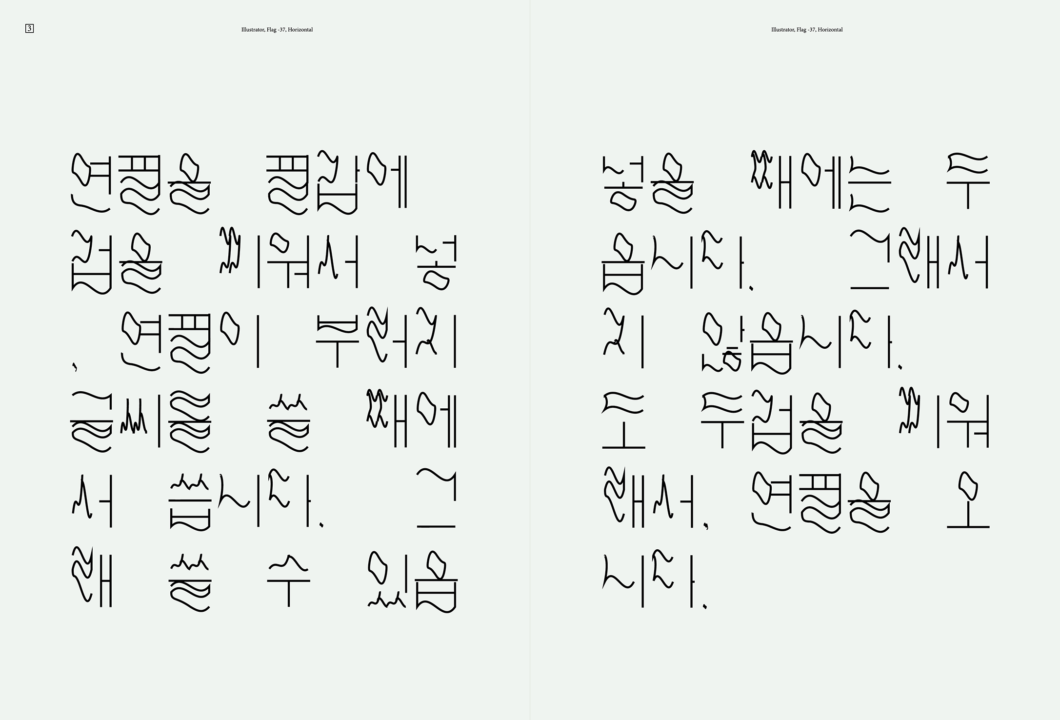
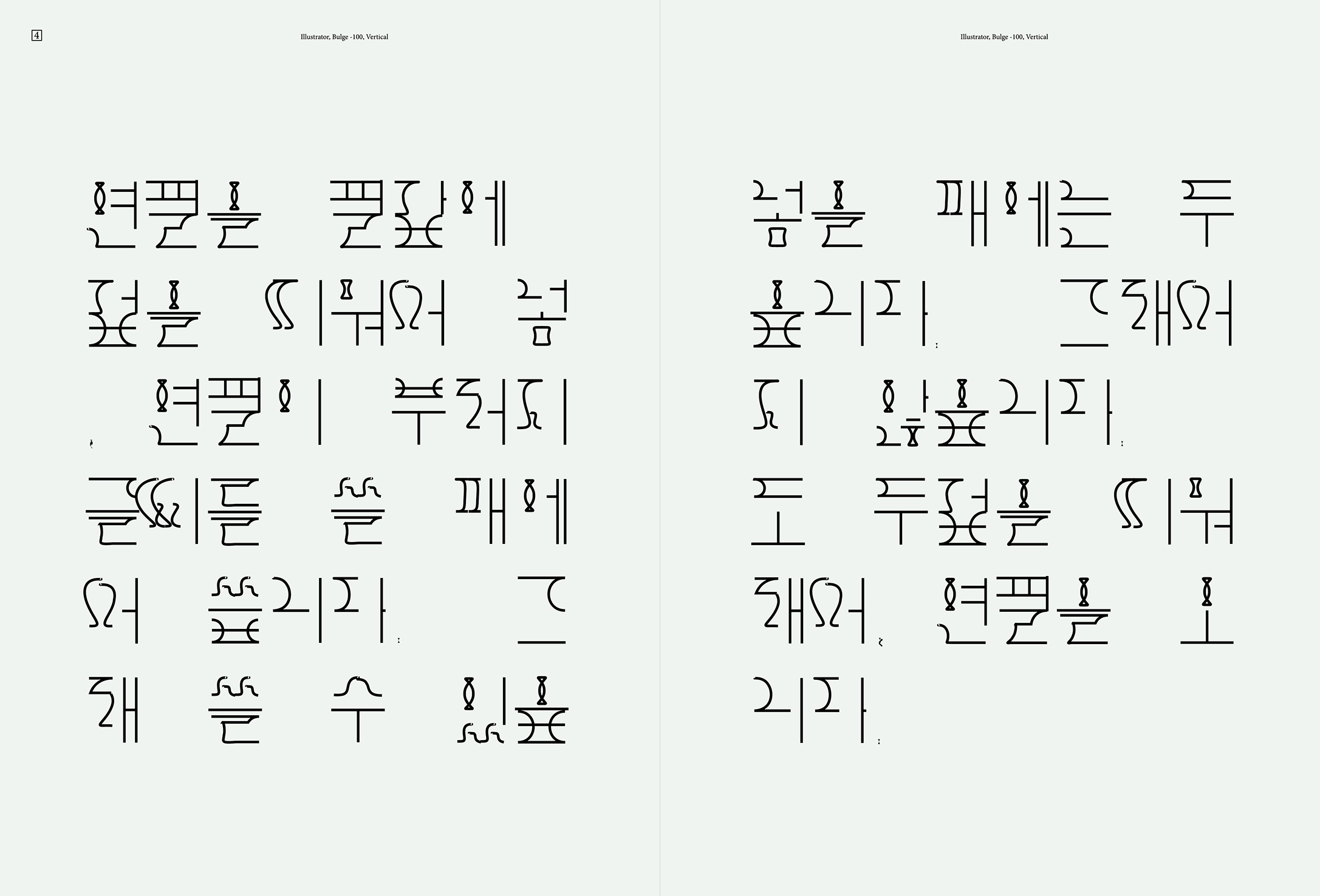
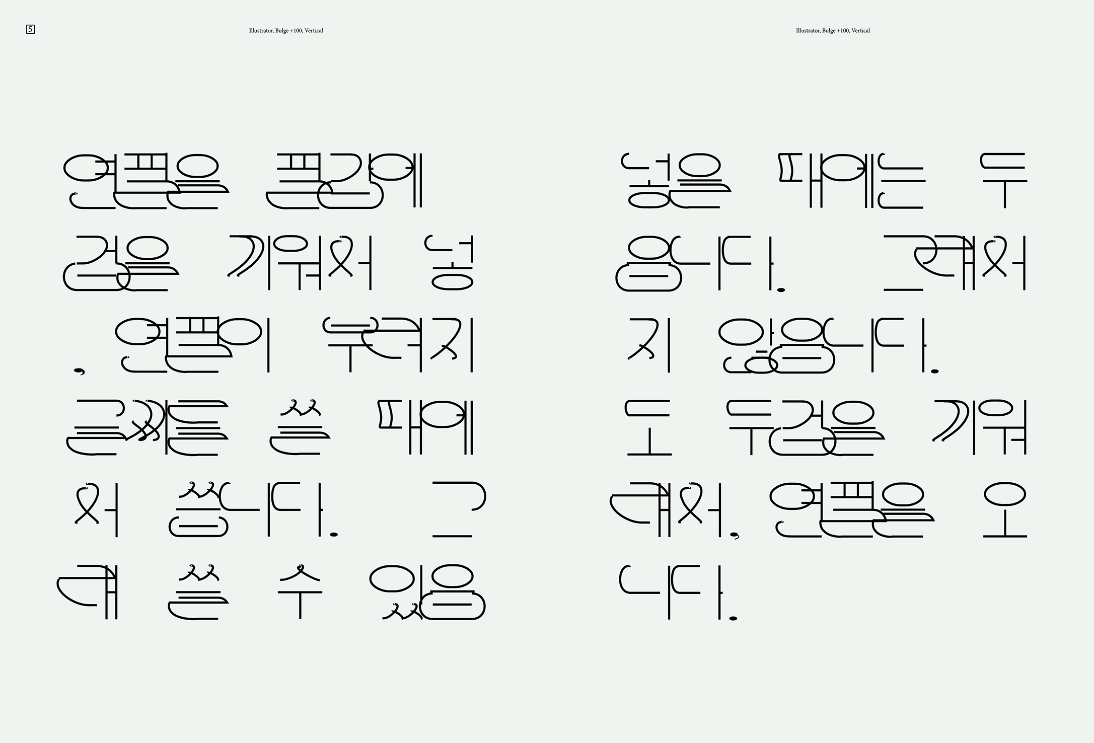
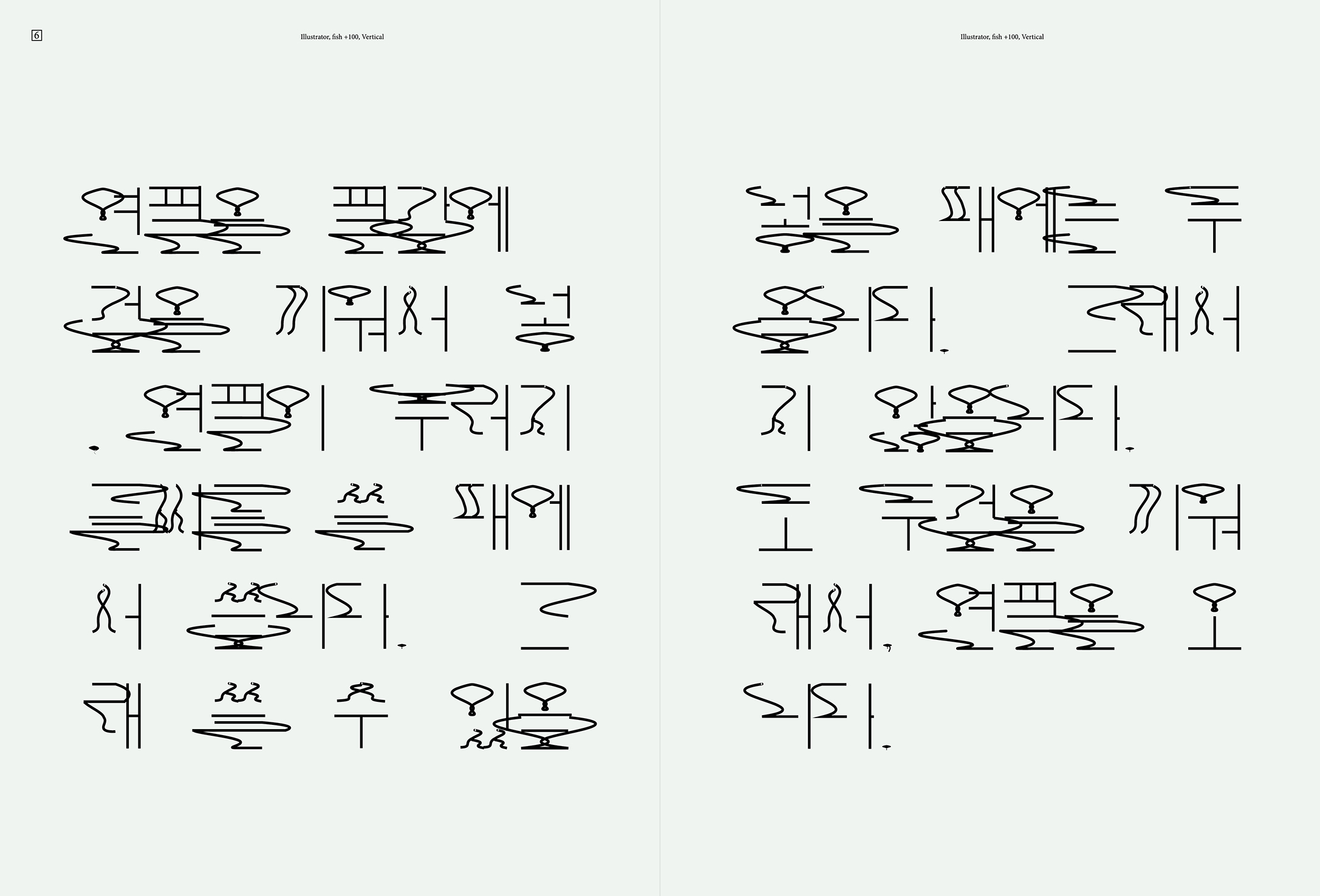
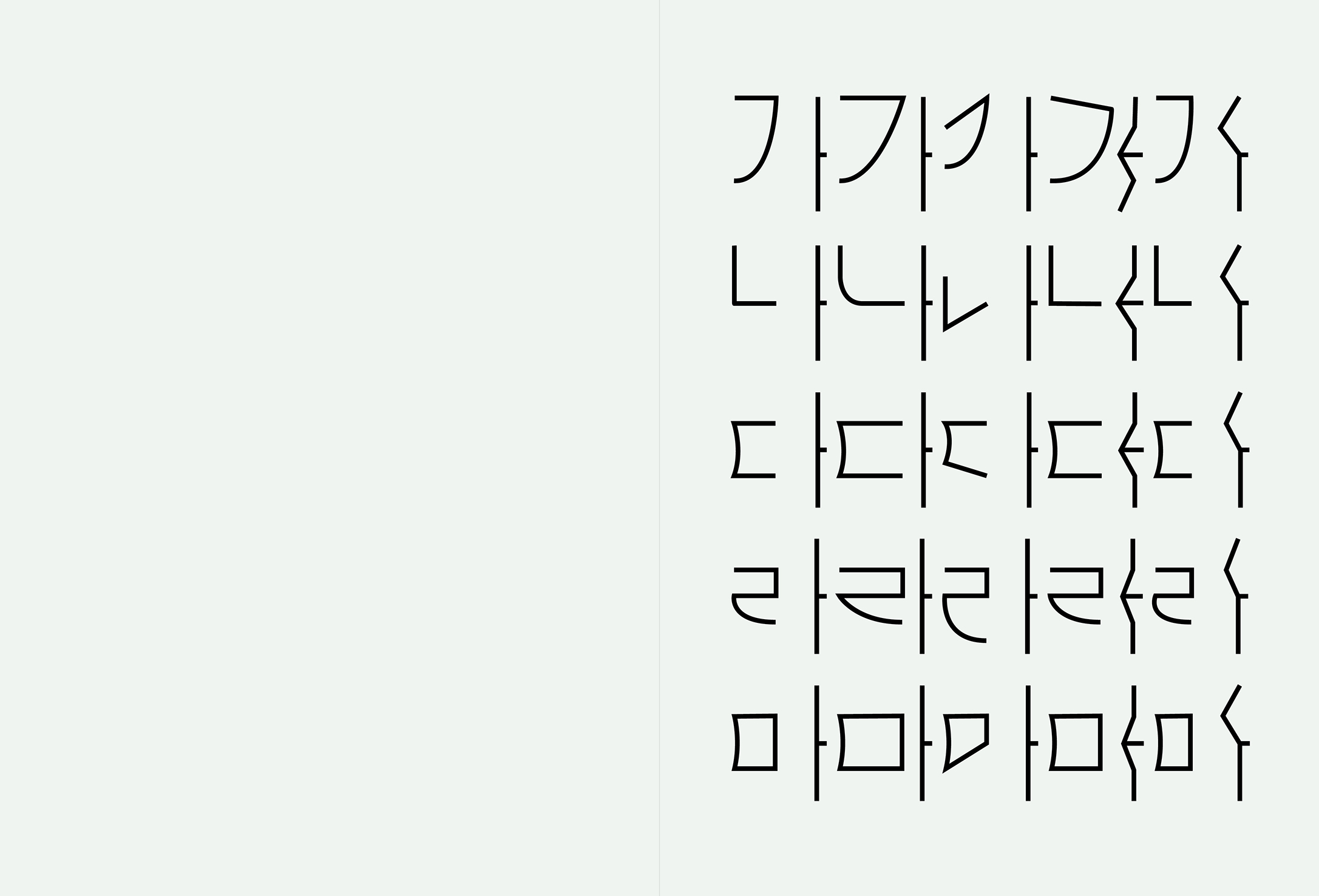
A typographic project based on the dual meaning of the Korean word “che,” referring both to a typeface and the notion of “pretending to be proper.”
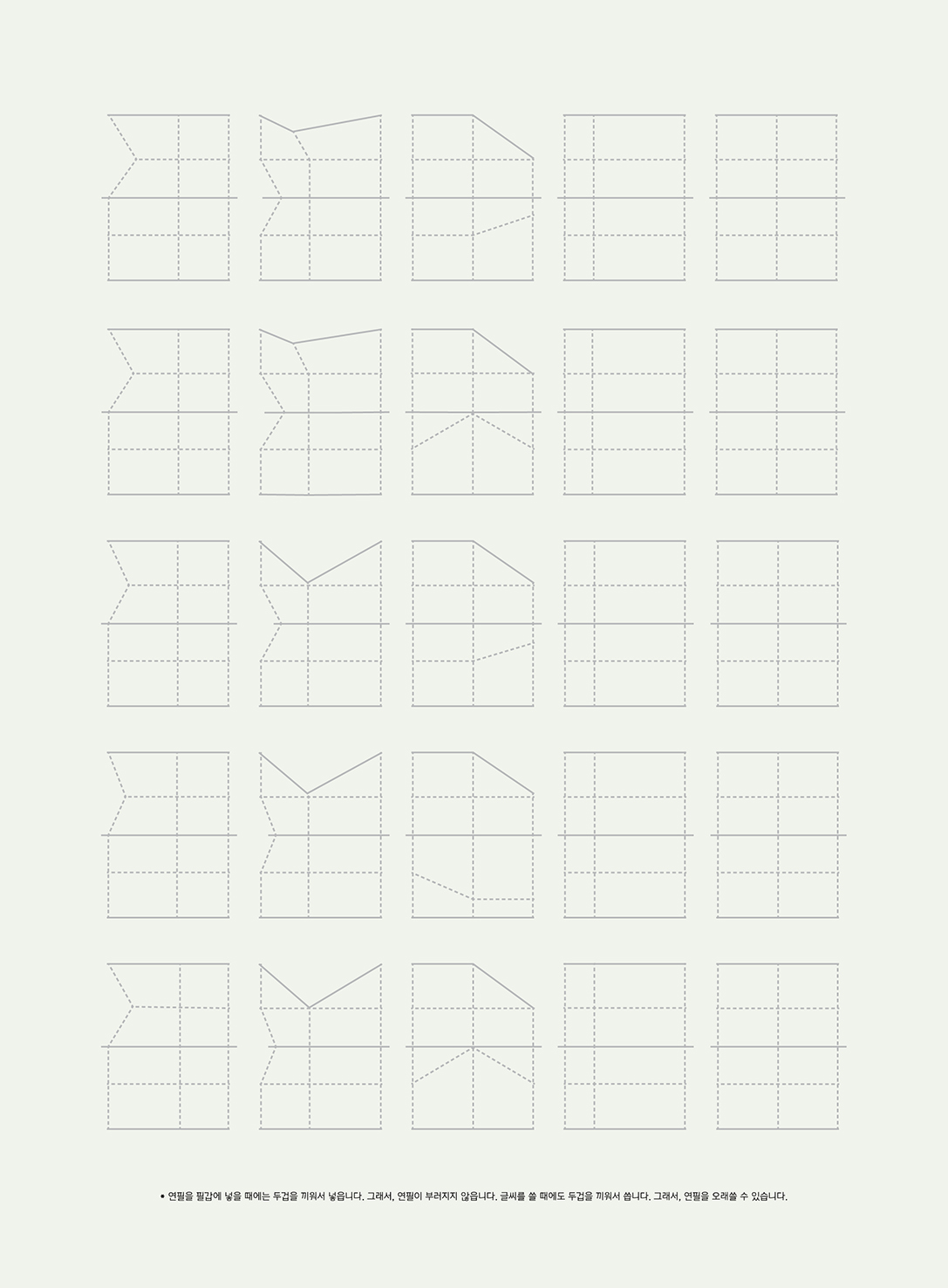
Following the conventions of “correct” handwriting, the letterforms shift and adapt in response to a destabilized grid system, reflecting the tension between order and deviation.